Map labels
All map labels use IBM Plex Sans. Create hierarchy with weight, case and letter spacing, not with extra typefaces. Water is always italic.
Label only what the title or the data refers to. A town that nobody mentions doesn’t get a dot.
Label styles
Sizes are for a map built 800 px wide. Scale them with the map, and never go below 9 px.
| Label | Style | Colour |
|---|---|---|
| FOCUS COUNTRY | Semibold 13 · capitals · tracked 220. Track it out to fill the country. | Ink |
| NEIGHBOUR | Medium 11 · capitals · tracked 80 | Land text |
| Capital | Semibold 12, with a 6 px square | Ink |
| City | Regular 12, with a 5 px dot | Ink |
| Region or province | Regular 11 · sentence case | Land text |
| O C E A N | Italic · capitals · tracked 300 | Water text |
| Sea or lake | Italic 12 | Water text |
| River | Italic 10, set along the line | Water text |
| Annotation | Regular 11, two lines at most, with a 0.75 px leader line | Ink |
| Area label | Semibold 11 · white on #1F5247 · 6 px padding | White |
The colours come from the basemap palettes. Location and data-led maps use the same styles, each with its own Ink, land text and water text.
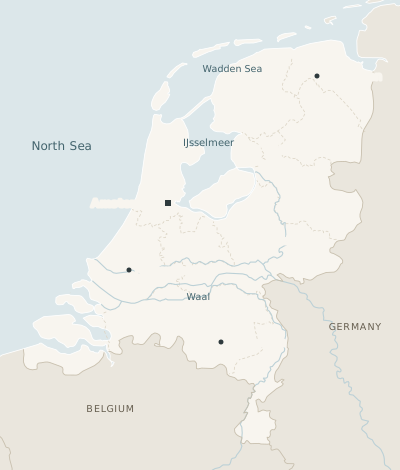
Placement
- Halo
- A label that crosses a line gets a 3 px halo in the colour underneath, so that it stays readable without a box.
- Points
- Put the label to the right of its symbol where it fits, otherwise to the left. Keep it close and on the same baseline.
- Areas
- Centre the label in the area, and track capitals out to span it.
- Water
- Curve or angle the label to follow the water body.
- Annotations
- Keep leader lines short and straight, horizontal or vertical. Write in headline style: short, with the most important words first.
- Values
- Label the area or point the title talks about with its value, such as “Groningen 46%”, rather than making readers look it up in the key.
Labels in boxes, labels that cover data, rotated labels on land, and a second typeface for hierarchy.